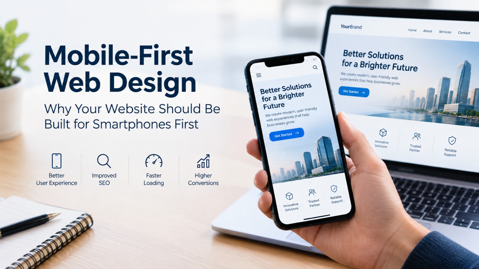
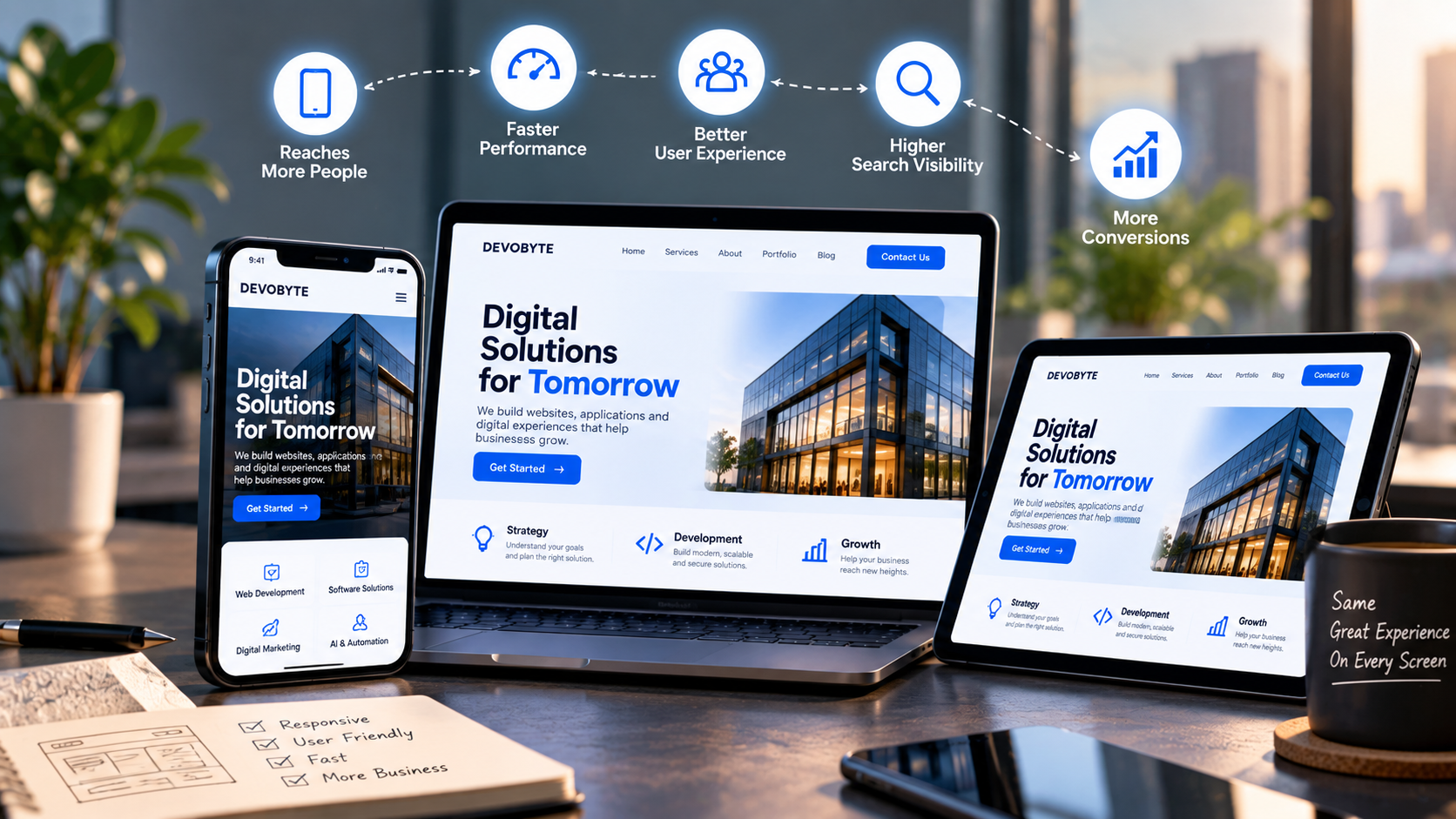
A few years ago, having a website was enough to establish an online presence. Today, that is no longer the case. People are accessing websites from smartphones throughout the day, whether they are searching for a product, comparing services, reading information, or looking for a local business. If a website does not work well on a smaller screen, businesses can lose potential customers before they even get a chance to understand what they offer. This is why mobile-friendly websites have become an essential part of a modern digital presence.
What Does a Mobile-Friendly Website Mean?
A mobile-friendly website is designed to provide a smooth browsing experience across smartphones, tablets, laptops, and desktop computers. Instead of displaying the same fixed layout on every device, a responsive website automatically adjusts its structure, images, text, buttons, and navigation according to the screen size.
For visitors, this means they can read content without constantly zooming in, tap buttons comfortably, navigate menus easily, and access important information without unnecessary scrolling. A responsive design focuses on making the website usable rather than simply making it fit on a smaller screen.
Mobile Users Expect a Better Experience
When someone visits a website from a smartphone, they expect the experience to be simple and convenient. They should be able to find the information they need without struggling with small text, misplaced buttons, or content that extends beyond the screen.
A poor mobile experience can create unnecessary friction. If a customer has to zoom in to read a service description or repeatedly move the screen from side to side, they may decide to leave the website and look for another option.
A mobile-friendly website removes these barriers and allows visitors to interact with a business more naturally.
Website Speed Matters on Mobile
Mobile responsiveness is not only about layout. Performance is equally important. Large images, unnecessary animations, excessive scripts, and poorly optimized website elements can increase loading time.
Visitors generally do not want to wait for a page to become usable. A website that loads efficiently can help users reach the information they are looking for more quickly and continue exploring the business.
For businesses, this means mobile optimization should include both responsive design and performance optimization. Compressing images, reducing unnecessary resources, optimizing code, and using appropriate technologies can all contribute to a smoother experience.
Mobile-Friendly Design Can Improve User Engagement
A website's design can influence how visitors interact with its content. When navigation is simple and information is clearly presented, users can move from one section to another without confusion.
For example, a service-based business may want visitors to explore its services and submit an enquiry. An e-commerce business may want customers to browse products and complete a purchase. A professional website may want visitors to view a portfolio and contact the company.
On a mobile device, these actions need to be easy to complete. Clear navigation, readable content, properly sized buttons, and simple forms can make the overall journey more convenient.
Mobile Responsiveness and Search Visibility
Search engines aim to provide users with useful results and a good browsing experience. Mobile accessibility is therefore an important consideration when developing and maintaining a website.
A business may invest significant time in SEO and content, but if visitors arrive through search and encounter a website that is difficult to use on their phones, that effort may not translate into meaningful engagement.
A mobile-friendly website allows businesses to build their content and search strategy on a stronger technical foundation while providing a better experience for people who discover them through search.
Your Website Represents Your Business
For many customers, a website is one of their first interactions with a business. The experience can influence how they perceive the company.
A website that looks professional, loads efficiently, works smoothly on mobile devices, and makes information easy to find can create a more reliable digital experience. On the other hand, a website that looks outdated or difficult to use can make visitors question whether the business keeps its digital presence up to date.
This is particularly important for businesses that depend on online enquiries, bookings, purchases, or lead generation.
Mobile-Friendly Does Not Mean Mobile-Only
Making a website mobile-friendly does not mean designing only for smartphones. Businesses still need to provide a good experience for people using tablets, laptops, and desktop computers.
Responsive web design allows a single website to adapt to different screen sizes while maintaining consistent branding and functionality. This approach avoids creating completely separate experiences for different devices and makes it easier to maintain the website over time.
The goal is simple: the website should work well wherever the customer chooses to access it.
Important Elements of a Mobile-Friendly Website
Businesses should consider several elements when evaluating their websites for mobile users. Text should remain readable without zooming, navigation should be straightforward, and buttons should have enough space to be tapped comfortably.
Images and videos should adjust to the available screen width without breaking the layout. Forms should be simple to complete, and important information such as contact details, services, pricing, or calls to action should be easy to locate.
The website should also be tested across different devices and screen sizes. A page that looks perfect on one smartphone may still have layout or usability problems on another device.
Mobile Experience Can Influence Conversions
The ultimate purpose of many business websites is not simply to attract visitors. It is to encourage them to take an action.
That action could be contacting the business, requesting a quotation, booking an appointment, purchasing a product, signing up for a service, or submitting an enquiry.
If the website makes these actions difficult on mobile devices, potential customers may abandon the process. A well-structured mobile experience reduces unnecessary steps and makes it easier for visitors to move from discovering a business to interacting with it.
Mobile Optimization Should Be Part of Website Development
Mobile responsiveness should not be something added after a website has already been completed. It should be considered from the beginning of the design and development process.
Designers and developers should think about how content will behave on different screen sizes, how users will navigate with touch controls, how images will scale, and how the website will perform on mobile networks.
Testing should also be part of the development process. Checking menus, forms, images, buttons, page speed, and content across different devices can help identify problems before customers encounter them.
Why Businesses Can No Longer Treat Mobile-Friendly Design as Optional
A business website needs to adapt to the way people actually use the internet. Smartphones have made online browsing more immediate and accessible, and customers expect websites to work smoothly on the devices they use every day.
Being mobile-friendly is therefore not simply about following a design trend. It is about making sure customers can access information, understand a business, interact with its services, and take action without unnecessary barriers.
A website should work for the customer, regardless of the screen they are using. By investing in responsive design, performance, usability, and continuous testing, businesses can create a digital experience that is easier to access and better prepared for the expectations of modern users.
The question is no longer whether a business should have a mobile-friendly website. The more important question is whether its website is providing the experience that today's customers expect.